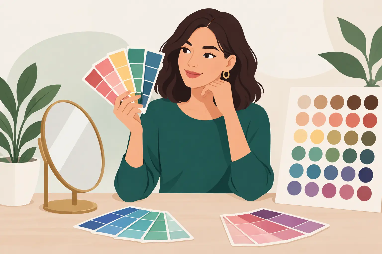
That black top you keep reaching for may be easy, but it is not automatically your best color. If it makes your under-eyes look stronger, flattens your skin, or feels like it wears you instead of the other way around, the problem is not your style. You may just need a clearer personal color palette.
A useful palette takes the guesswork out of getting dressed. It shows you which colors make your skin look clearer, your eyes more noticeable, and your outfits more intentional. It also makes a crowded closet easier to use because pieces start working together instead of competing.
What a Personal Color Palette Actually Does
A personal color palette is a set of shades that harmonize with your visible features: your skin’s undertone, hair depth, eye color, and the contrast between them. It is not a rulebook that bans half the color wheel. Think of it as a shortcut for choosing colors that support your natural coloring.
The payoff is practical. When your best colors are doing the work, a simple white tee, knit, or button-down can look more polished with almost no extra effort. Shopping gets faster because you know which greens, reds, blues, and neutrals are worth trying on. Planning outfits gets easier because your clothes share a more consistent visual language.
Color analysis often uses seasonal groups such as Spring, Summer, Autumn, and Winter. Those labels can be helpful, especially as a starting point, but they are not the whole story. Two people may both fit a “Winter” category yet look best in different levels of brightness, depth, and contrast. Your real goal is not to memorize a season. It is to recognize the color qualities that make you look awake, balanced, and like yourself.
Start With the Color Qualities, Not Random Swatches
Before you pick exact shades, look at four qualities: temperature, depth, clarity, and contrast. This gives you a more flexible palette than simply deciding you can only wear a few named colors.
Temperature: warm, cool, or neutral
Warm colors have more yellow, golden, or earthy influence. Think camel, tomato red, olive, coral, and cream. Cool colors lean blue, rosy, icy, or blue-gray, such as cobalt, berry, charcoal, true white, and silver-gray.
Neutral coloring can handle both directions, though usually with a preference. If bright orange makes your complexion look uneven but soft peach works well, you may be neutral with a slight warm lean. If pure white feels harsh but soft white looks fresh, that is useful information too.
Jewelry can offer a clue, but it is not a final test. Gold looking good on you does not prove you are warm, and silver looking good does not make you cool. Your face gives the more reliable answer.
Depth: light, medium, or deep
Depth describes how light or dark your overall coloring appears. Someone with dark hair, deep eyes, and medium-to-deep skin may carry espresso, ink navy, and rich burgundy with ease. Someone with light hair, light eyes, and fair skin may look more balanced in dove gray, soft denim, periwinkle, and muted rose.
This does not mean a light person cannot wear black or a deep person cannot wear pastel shades. It means those colors may need a different approach. A softer palette can make black easier by moving it away from the face or pairing it with a flattering scarf, neckline, makeup, or accessory. A deeper palette can make pale colors work by choosing saturated versions rather than chalky ones.
Clarity: bright or muted
Bright colors are clear, high-energy, and close to pure pigment: fuchsia, crisp turquoise, emerald, and bright royal blue. Muted colors have gray, brown, or softness added: dusty blue, sage, mauve, mushroom, and soft plum.
If vivid colors make you look energized, you may suit higher clarity. If they pull attention away from your face, softer shades may be better. This is one of the most useful distinctions because people often blame a color when the real issue is its intensity. You may look great in blue, for example, but not every blue.
Contrast: low, medium, or high
Contrast is the difference between your hair, skin, and eye colors. High-contrast coloring often looks strong in distinct pairings, such as black and white, navy and ivory, or a dark jacket over a light shirt. Lower contrast can look more natural in blended combinations, like taupe with soft blue or olive with warm beige.
Your outfit contrast matters too. If your features are soft and blended, three sharply different colors can feel visually loud. If your coloring is high contrast, an outfit made entirely of similar mid-tones may feel flat. There are exceptions, but this is a strong styling lever once you notice it.
How to Find Your Best Colors at Home
The easiest test is simple: compare colors near your face in daylight. Do it without a beauty filter, heavy makeup, or colored lighting. A window facing indirect daylight is ideal. Direct sun can create strong shadows, while warm indoor bulbs can make almost every color look deceptively golden.
Start with pairs rather than a huge pile of clothing. Compare cream with optic white, camel with cool gray, coral with raspberry, olive with emerald, and warm red with blue-red. Hold each color under your chin and look at your face before you judge whether you like the garment itself.
The better shade usually makes your skin look more even, reduces the appearance of redness or shadows, and brings definition to your eyes and lips. The less flattering option may emphasize texture, make your jawline seem less defined, or create a tired cast around the eyes. Take quick photos in the same spot if your eyes are adjusting too quickly to decide.
Be honest about the fabric and fit. A color test cannot rescue a shirt that is too tight, too shiny, or simply not your taste. It can, however, explain why one version of a favorite item makes you feel put together while another never leaves the closet.
Build a Palette You Will Actually Wear
A palette needs to work with your real week, not just look good as a grid of swatches. Start with colors you already enjoy wearing and identify the versions that get you compliments or make you feel confident. Then build around them.
Choose two to four dependable neutrals for the foundation. These might be navy, soft white, charcoal, mushroom, espresso, olive, or warm beige. Your neutrals do not have to be boring. Deep teal or softened burgundy can function like a neutral if you can pair it with most of your wardrobe.
Next, add four to six accent shades. These are the colors that bring personality to tops, dresses, knitwear, bags, and details near your face. If cool, muted shades suit you, that could mean dusty rose, soft navy, slate blue, lavender, and sage. If warm, bright colors suit you, try coral, clear turquoise, tomato red, warm green, and creamy ivory.
Finally, include a few statement colors for occasions when you want more impact. A statement shade should still belong to your palette, but it can be bolder than your everyday choices. Think cobalt for a presentation, rich berry for dinner, or emerald for a wedding guest look.
Use Your Palette Without Replacing Your Closet
You do not need to throw away every item outside your ideal range. Color matters most near your face, so start with tops, jackets, scarves, hats, glasses, and earrings. Pants, skirts, shoes, and bags have more flexibility because they sit farther away.
If you love a color that is not your strongest, create space between it and your face. Wear that yellow skirt with a flattering navy top, or layer a black blazer over a shirt in one of your best shades. Makeup, hair color, and lighting can also change how a color reads, which is why color analysis should guide your choices rather than control them.
Use the palette when you shop, too. Before adding something new, ask whether it works with at least three pieces you already own. A flattering color that cannot make an outfit is still likely to become closet clutter. The best purchases are the ones that fit your palette, your lifestyle, and the way you actually get dressed.
Make Color Part of Your Weekly Outfit Plan
Once you know your strongest shades, organize your wardrobe around them. Group similar colors in your closet or digital wardrobe, then build a few reliable color combinations for work, casual plans, dates, and travel. This turns “What should I wear?” into a faster decision.
For example, someone with a cool, medium-depth, muted palette might rotate soft white and charcoal for work, add slate blue or mauve near the face, and use berry accessories for evening. Someone with warm, high-contrast coloring might build outfits around cream and deep olive, then use clear coral or teal for energy. Neither approach is better. The right one is the one that makes your own features look more alive.
If you want a faster read on your coloring, SHMOT can scan a selfie, identify visible color traits, and turn them into a palette you can use while building outfits from your own wardrobe. Take the result as a starting point, test it in real life, and keep the shades that make getting dressed feel easy.