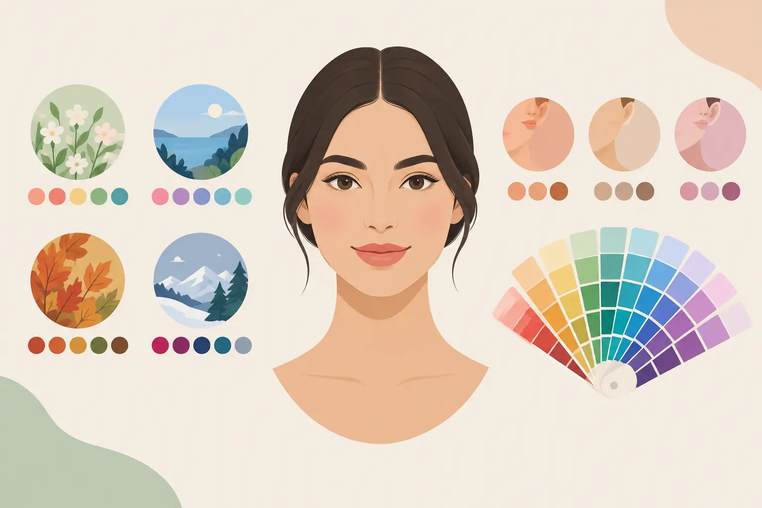
You can have warm undertones and still look far better in a muted olive than a bright marigold. That is the part of personal color analysis that gets lost in quick quizzes. Seasonal colors versus undertones is not an either-or decision. Your undertone gives you a starting temperature, while your season explains how light, deep, bright, or soft your best colors need to be.
Knowing the difference makes shopping easier. Instead of asking whether a sweater is simply “warm” or “cool,” you can tell whether its specific version of warm or cool will support your features. The result is a wardrobe that looks more intentional, with fewer colors that seem great on the hanger but feel off once you put them on.
What undertones tell you
Undertone is the subtle color cast beneath the surface of your skin. It stays relatively consistent even when your skin tans, breaks out, gets flushed from the cold, or changes with your lighting. Most people fall somewhere on a warm, cool, neutral, or olive spectrum.
Warm undertones tend to have a golden, peachy, or yellow-leaning cast. Cool undertones often lean rosy, bluish, or pink. Neutral undertones sit closer to the middle and can borrow from both sides. Olive skin can have a green-gray cast, often with warm, cool, or neutral depth underneath it.
Undertones are useful because they explain why certain color temperatures can make your skin look clearer while others can make it look dull. A cool berry lipstick may bring life to someone with cool coloring, while a yellow-based orange-red might fight their complexion. For someone warm, the reverse may be true.
But undertone alone is a blunt tool. It cannot tell you whether you need a soft dusty rose or a vivid fuchsia, a dark forest green or a light sage. That is where seasonal color analysis becomes more useful.
What seasonal color analysis adds
A seasonal palette considers your full visible coloring, not just skin temperature. It looks at the relationship between your skin, hair, and eyes, including contrast and overall intensity. Traditional systems use four seasons: Spring, Summer, Autumn, and Winter. Expanded systems divide them into 12 or more sub-seasons.
Each season combines temperature with other traits:
- Spring colors are warm, light, and clear. Think coral, warm aqua, butter yellow, and fresh leaf green.
- Summer colors are cool, light to medium, and soft. Think powder blue, lavender, dusty rose, and soft navy.
- Autumn colors are warm, deep, and muted. Think rust, moss, camel, brick red, and dark teal.
- Winter colors are cool, deep or bright, and high-contrast. Think cobalt, black, icy pink, emerald, and true red.
The key word is combination. A bright Spring and a deep Autumn can both have warm undertones, yet they may look best in completely different oranges, greens, neutrals, and reds. One needs clarity and lightness. The other needs depth and earthiness.
Temperature is only one setting
Think of undertone as the color temperature control on your camera. Seasonal analysis adds the exposure, saturation, and contrast settings. You need all of them to get the picture right.
For example, a warm-toned person with low contrast and muted features may disappear in bright tomato red. The color is technically warm, but it is too intense. A softened terracotta, cinnamon, or clay red is more likely to look balanced. Meanwhile, a cool-toned person with sharp contrast between dark hair and clear eyes may find that dusty blue feels flat, while saturated royal blue looks natural.
This is why advice like “warm people should wear gold and cool people should wear silver” can be helpful but incomplete. It can point you in the right direction, but it does not build a full outfit palette.
Seasonal colors versus undertones: which matters more?
For choosing lipstick, foundation, or a basic metal, undertone can be a fast and practical filter. It is especially useful when you need an answer in a store and do not have time to compare ten shades.
For clothing, seasonal color usually gives you the better answer. Clothes cover more visual space than makeup, sit close to your face, and need to work with your hair, eyes, and natural contrast. A seasonal palette helps you choose a cream that flatters you instead of a cream that turns you yellow, or a navy that looks crisp instead of heavy.
That said, no system should overrule your eye. Personal color analysis is a decision tool, not a uniform. If a color makes you feel like yourself, there is room for it. The goal is not to ban half the color wheel. It is to know which shades do the most work for you, especially in the pieces you wear near your face.
How to spot the difference in real outfits
Start with two versions of the same color family. Hold them near your face in indirect daylight, with minimal makeup if possible. Do not focus only on whether your skin looks lighter or darker. Look for clarity.
The better color usually makes your eyes more noticeable, evens out the appearance of your skin, and lets your features show up before the garment does. The less suitable color can emphasize shadows, redness, under-eye circles, or a gray cast. You may also notice that your face seems to recede while the shirt takes over.
Try these comparisons:
- If you are testing blue, compare dusty denim with vivid cobalt, then compare navy with soft slate.
- If you are testing red, compare brick red with tomato, cranberry with berry, and rust with clear coral.
- If you are testing neutrals, compare ivory with optic white, taupe with camel, charcoal with black, and soft navy with ink navy.
- If you are testing green, compare sage with olive, emerald with pine, and mint with chartreuse.
You are not looking for a universally “good” color. You are looking for the version that creates the least visual friction on you.
Build a wardrobe around your best color settings
Once you know your likely season, use your palette where it has the highest payoff: tops, jackets, scarves, dresses, glasses, hats, and makeup shades. These pieces frame your face, so a compatible color has an immediate effect.
For pants, shoes, and bags, you can be more flexible. A pair of black jeans can still work for a soft Summer palette, particularly when paired with a flattering top and lighter accessories. A Winter can wear warm tan boots without abandoning a cool palette. Distance from the face changes the impact.
Neutrals deserve special attention because they become the backbone of repeatable outfits. Rather than defaulting to black, white, beige, and gray, identify your best versions. A warm, muted palette may rely on mushroom, olive, chocolate, and cream. A cool, clear palette may work best with charcoal, navy, crisp white, and cool taupe.
If you use a digital wardrobe, tag items by their color family and how well they fit your palette. That makes it easier to see whether you own five nearly identical “safe” black tops but no flattering work-ready color. A tool like SHMOT can turn a selfie-based palette and your scanned closet into outfit options, so your color analysis becomes something you can actually wear on Monday morning.
When your undertone and season feel unclear
Many people do not fit neatly into a social media filter. Lighting, self-tanner, dyed hair, makeup, and phone cameras can all distort the clues. Olive and neutral complexions are particularly easy to misread because they can appear warmer or cooler depending on the surrounding color.
If you are stuck between seasons, do not start by chasing a label. Start by finding your repeat winners. Which blue gets compliments? Does pure white brighten you, or does soft white look calmer? Do you look stronger in crisp black or in charcoal? Those answers reveal contrast and intensity, which are often more useful than obsessing over a single warm-versus-cool verdict.
Your palette can also shift slightly when you change your hair color, especially if the change is dramatic. Your skin undertone does not suddenly change, but the contrast around your face does. Recheck your best neutrals and accent colors after a major color appointment.
The most useful palette is the one that helps you get dressed with less second-guessing. Keep the colors that make your face look awake, use the rest farther from your face, and let every outfit start from what already works for you.