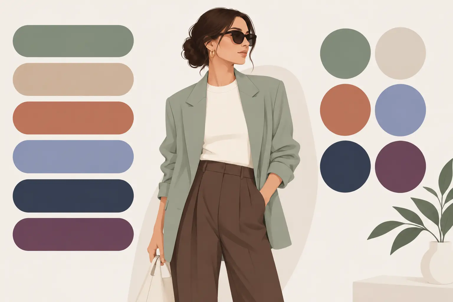
The most useful color palette trends 2026 are not about replacing your whole closet with one viral shade. They are about making your existing wardrobe look more intentional. Think richer neutrals, colors with a softened finish, and contrast that works with your own features rather than against them.
That is good news if you are tired of buying statement pieces that only work for one season. The direction for 2026 is less “wear this exact color” and more “build a palette that gives you options.” A great color should earn its place in your wardrobe: it should work with your complexion, pair easily with what you own, and fit more than one plan on your calendar.
The color palette trends 2026 are moving toward depth
For the past few years, fashion has swung between ultra-minimal beige and high-impact, internet-driven brights. In 2026, the strongest palettes sit in the middle. They feel expressive, but more grounded.
Expect to see deep brown, warm stone, ink navy, mossy green, dusty blue, oxblood, butter yellow, faded coral, and muted lilac used as wardrobe colors rather than occasional accents. These shades have enough personality to make an outfit feel current, but they are easier to rewear than neon or highly saturated primary colors.
The key shift is tonal depth. A color does not need to be dark to feel rich. A pale yellow with a creamy undertone can look considered. A washed red can feel more modern than a bright cherry shade. A soft blue-gray can add more life to an outfit than plain black.
Rich neutrals are taking the lead
Black will always be useful, especially for evening, workwear, and fast outfit decisions. But 2026 gives other neutrals more space. Espresso, cocoa, olive, charcoal, mushroom gray, deep navy, and warm ivory are becoming the building blocks of polished everyday looks.
These shades work because they create dimension without making you look overly styled. An espresso knit with medium-wash denim feels relaxed but put together. Charcoal trousers with a pale blue shirt are office-ready without defaulting to black. A warm ivory tee can brighten an outfit more gently than crisp white.
There is a trade-off: not every neutral is neutral on every person. Warm beige can make cool or high-contrast coloring look washed out, while stark black can overpower someone with low contrast and soft features. Instead of choosing a neutral because it is labeled “classic,” check what it does near your face.
Try a three-neutral formula
Build a small rotation of three neutrals: one dark, one medium, and one light. For example, you might choose deep navy, taupe, and soft white. Or try chocolate, olive gray, and cream. This gives you enough variation to create outfits without constantly reaching for the same black pants and white top.
When the undertones work together, getting dressed becomes faster. Your jacket, shoes, bag, and base layers start to mix naturally.
Softened brights make color easier to wear
Bright color is not disappearing. It is becoming more wearable. Instead of sharp, candy-like tones, look for shades that seem slightly dusted, sun-faded, or warmed by a neutral base.
Butter yellow is one of the clearest examples. It feels fresh in a tee, button-down, cardigan, or sneaker, but it is less demanding than a bright lemon shade. Powder blue, muted tangerine, soft violet, pistachio, and faded red work the same way. They add energy without taking over the entire look.
For work, use softened brights in one piece at a time. A powder-blue overshirt with navy trousers, or a muted red knit under a gray blazer, brings personality while keeping the outfit professional. For weekends, pair a soft bright with denim, white sneakers, or a neutral jacket.
If you prefer a minimal wardrobe, do not force yourself into colorful head-to-toe outfits. One color-forward layer is enough. A scarf, knit, handbag, cap, or shoe can update a familiar outfit without creating a hard-to-style purchase.
Personal contrast matters more than a trend shade
The best 2026 palettes will be personal. Your coloring has its own level of contrast: the visible difference between your hair, skin, and eyes. Matching that contrast often makes more impact than copying a color from a runway or social feed.
If you have high contrast, such as dark hair with lighter skin or bright, defined features, clearer combinations may suit you well. Think black and ivory, deep navy with crisp blue, or forest green against cream. You can still wear softer colors, but grounding them with a darker neutral helps keep your features visible.
If your features are lower contrast, softer combinations may look more natural. Try slate with dusty rose, camel with muted teal, or soft gray with lavender. Wearing two highly contrasting colors can sometimes make the outfit arrive before you do.
This is where personal color analysis becomes practical rather than restrictive. It does not tell you that you can never wear a shade. It helps you choose the version of that shade that works best. Maybe bright orange is not your color, but terracotta is. Maybe optic white feels harsh, while pearl or cream looks excellent.
How to build a 2026-ready palette from clothes you own
You do not need a major closet reset. Start by reviewing the pieces you already wear repeatedly. Those are usually the colors that fit your lifestyle and feel good on you.
First, pull out your ten most-worn items: tops, layers, pants, dresses, and shoes. Notice the colors that repeat. Then separate them into your base neutrals, supporting neutrals, and accent colors. This makes gaps obvious. You may have six black tops but no lighter layer for spring, or several blue pieces without a shoe color that connects them.
Next, choose two trend-led shades that support your current palette. If your closet already leans navy, gray, and white, butter yellow or faded red could add warmth. If you mostly wear brown, cream, and olive, dusty blue or muted lilac can create contrast without clashing.
Finally, test combinations before buying anything. Take photos in daylight or use a virtual try-on tool to compare shades close to your face. The right color usually makes your skin look clearer and your eyes more noticeable. The wrong one can emphasize under-eye shadows or make your complexion look flat, even if the item looks great on a hanger.
Outfit ideas that use the trend without feeling costume-like
For a weekday office look, start with charcoal trousers and a warm ivory top, then add a dusty blue blazer or cardigan. It is a simple palette, but the blue gives the outfit a 2026 update.
For dinner or a date, try dark denim, an espresso jacket, and a muted coral or oxblood top. The dark base keeps it refined, while the color near your face adds warmth and presence.
For travel, build around one medium neutral such as olive, mushroom gray, or navy. Add a cream tee, dark pants, and one softened bright layer. You will have multiple outfits without packing items that only work once.
For a casual weekend, pair butter yellow with medium denim and white or tan sneakers. If yellow is not flattering near your face, wear it as shorts, a skirt, a bag, or shoes instead. Placement matters as much as color choice.
Buy less, but buy with a color job in mind
A trend color is worth buying when you can name at least three outfits it will complete. If you cannot, it may be better as an accessory than a major purchase. This is especially true for colors that feel exciting online but unfamiliar in your daily life.
Before adding a new piece, ask: Does it work with my main neutral? Does it make at least two existing items easier to wear? Can I use it for work, social plans, or travel? A good answer to two of those questions is often enough. A good answer to all three means the item will likely stay in rotation.
Color trends should make your wardrobe feel more flexible, not more complicated. Use 2026’s richer neutrals and softer brights as options, then let your own coloring and routine make the final call.
Take a selfie, identify the shades that bring out your features, and plan outfits around colors you will actually want to wear again.