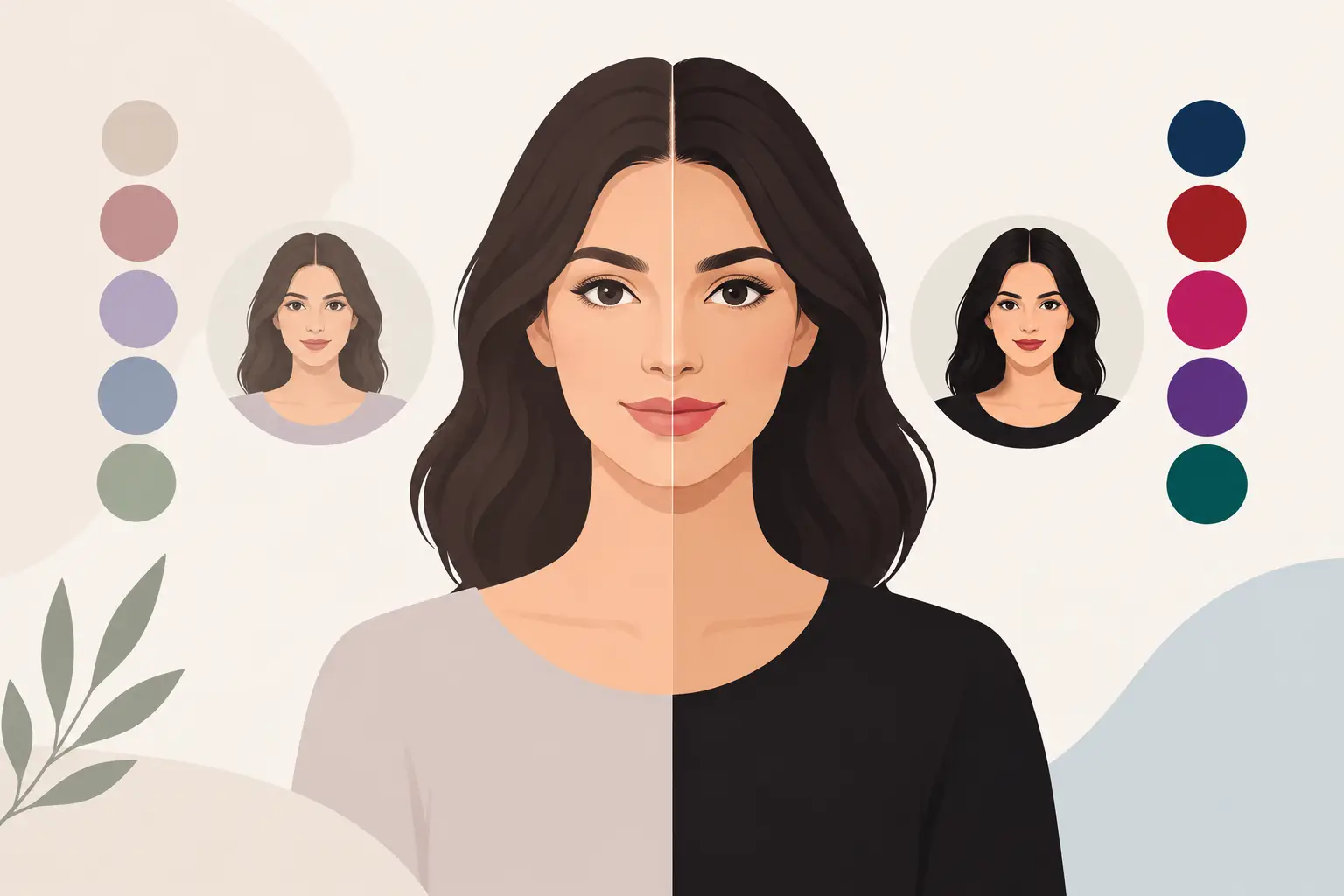
A black blazer can look crisp and intentional on one person, then feel oddly heavy on another wearing the exact same cut. The difference is often personal contrast. This guide for matching personal contrast helps you spot the visual strength in your own features, then reflect it in the colors, prints, and outfit combinations you already own.
Personal contrast is not a rulebook for what you are allowed to wear. It is a fast way to understand why some looks make your face look clear and awake while others take over the whole picture. Once you see it, choosing an outfit gets much easier.
What personal contrast actually means
Personal contrast is the visible difference between your skin tone, hair color, eye color, and facial features. Think of a black-and-white photo: are your features clearly distinct from one another, or do they blend into a softer overall range?
Someone with deep brown hair, fair skin, and bright blue eyes often reads as high contrast. Someone with medium brown hair, medium skin, and hazel eyes may read as medium contrast. Someone with light hair, light eyes, and light skin, or deep hair, deep eyes, and deep skin, can read as low contrast because their features sit close together in value.
This is separate from seasonal color analysis. Your season helps identify whether warm, cool, bright, soft, light, or deep colors flatter you most. Contrast tells you how much visual difference your best outfit can handle at once. You need both to make color choices feel personal rather than random.
The three contrast levels
High contrast: clear light-to-dark definition
High-contrast features hold their own next to distinct color pairings. Think white with black, cobalt with ivory, or a saturated red against a dark neutral. The eye reads the person first, not just the outfit.
If this sounds like you, a light shirt under a dark jacket may look especially natural. Strong color blocking, crisp stripes, defined lapels, and clear prints can work well because they echo the natural definition in your face.
The trade-off is that extremely muted, low-difference outfits can sometimes look a little faded. That does not mean every look needs black and white. You can create contrast with navy and cream, emerald and camel, or a bright accessory against a quieter base.
Medium contrast: balanced and flexible
Medium contrast sits between soft blending and sharp definition. Many people fall here, which is useful because you can move in either direction depending on the occasion.
Try two colors that are visibly different without being opposites: medium blue denim with a white tee and olive overshirt, burgundy with soft gray, or navy with medium-wash denim. Patterns with a clear but not dramatic difference in scale and color often feel especially easy.
For a more polished event, increase contrast slightly with a deeper jacket, brighter lip color, or lighter top. For a relaxed weekend look, bring it down with tonal layers. Your best range is usually balanced rather than extreme.
Low contrast: soft, tonal harmony
Low-contrast features often look most at home in outfits where colors sit close together in depth. A light taupe sweater with cream pants, charcoal with soft black, or chocolate with dark olive can create a cohesive, elevated effect.
This is not the same as wearing only beige. Low contrast can be dark, colorful, cool, or warm. The key is keeping the jump between shades more gradual. A navy shirt with black pants might feel more connected than a stark white shirt with the same black pants.
Very bold contrast can still be fun, especially for a night out or a statement photo. Just expect the clothes to take center stage more quickly. If that is the goal, wear it. If you want a natural, polished effect, keep the outfit closer in value.
How to find your contrast level
The simplest test is a clear, makeup-free or low-makeup selfie in indirect daylight. Pull your hair away from your face if possible and avoid filters, tinted sunglasses, or a brightly colored background. You are looking for your features, not the lighting setup.
First, squint at the image or turn it black and white. Notice whether your hair, eyes, brows, and skin appear strongly separated or relatively close in depth. Then compare your face to three simple color pairings: black and white, medium denim and soft gray, and cream with camel or chocolate with dark olive.
Ask one practical question: which pairing looks like it belongs next to your face? If black and white makes your features look sharper, you may lean high contrast. If medium pairings look most balanced, you may be medium contrast. If tonal combinations make your face look calm and defined, you may lean low contrast.
Be honest about what you see, but do not overthink one image. Lighting, hair color, a tan, and even brow makeup can change your apparent contrast. Your natural level is a useful starting point, not a permanent label.
Match personal contrast with outfit building
Start with the relationship between your top and bottom. It is the largest contrast decision in most outfits.
For high contrast, pair a light top with a dark bottom or jacket. A white knit, dark jeans, and black loafers is simple but visually defined. For medium contrast, try a slate tee with dark denim or an ivory shirt with olive trousers. For low contrast, build in a narrower range, such as a soft blue shirt with medium-wash jeans and gray sneakers.
Then check your face-level details. Earrings, glasses, scarves, hats, shirt collars, and makeup sit closest to your features, so they can either support or disrupt the effect. High-contrast glasses can give a high-contrast face even more definition. A low-contrast look may feel better with a translucent frame, a soft metal, or a frame close to your hair color.
Patterns work the same way. High-contrast coloring can often carry strong stripes, graphic checks, and bold color separation. Medium contrast usually suits moderate-scale patterns with a few related colors. Low contrast often looks polished in low-contrast plaids, tonal florals, subtle texture, and prints with blended edges.
Use contrast without making every outfit predictable
Matching your contrast does not mean wearing the same formula every day. It gives you control over the effect you want.
Increase contrast when you want to look more direct, visible, or formal. A darker blazer over a lighter shirt, a defined shoe color, or a brighter lip can add structure quickly. Lower contrast when you want a calmer, more minimal mood. Tonal layers tend to feel relaxed, expensive-looking, and easy to wear.
You can also place contrast strategically. If a stark black-and-white outfit feels too strong near your face, move the stronger difference lower: try a charcoal top with black pants and white sneakers. If an all-neutral outfit feels flat, add contrast through a belt, bag, or scarf instead of replacing the whole look.
Hair changes are worth considering, too. Going much lighter or darker can shift your overall contrast. That does not mean you need a new wardrobe after a salon appointment, but you may notice that different shirt colors, glasses, or makeup levels start making more sense.
Common mistakes when matching contrast
The most common mistake is treating black as a universal neutral. Black is powerful, especially near the face. If it makes your skin look shadowed or your features disappear, swap it for navy, espresso, charcoal, deep olive, or a softer version of your best dark neutral.
Another mistake is confusing contrast with brightness. A neon yellow top and a black skirt are high contrast, but the color may still clash with your undertone. Choose colors from your personal palette first, then decide how much difference you want between them.
Finally, do not judge an outfit only on a hanger. Take a quick photo in daylight. The camera makes it easier to see whether the outfit is supporting your face or competing with it. A Style Scan can also help identify your visible contrast alongside your coloring, then give you a consistent reference when you are planning looks from your own wardrobe.
The best contrast level is the one that makes you look like yourself, just more intentional. Start with one outfit this week, adjust the distance between its colors, and notice how quickly the right balance changes the whole look.